

Leverage: rebuilding MIFX from the ground up
Biometric authentication is designed to make fintech apps both secure and convenient, but when biometric tokens fail, the experience quickly turns frustrating. Earlier in 2024, our app suffers a critical issue caused biometric tokens to flush from the cache at an alarming rate—peaking at 97% in a single week—forcing users to fall back on PINs and undermining the feature’s purpose. This project explores how I tackled this invisible problem by reworking the caching and token management logic, reducing the biometric failure rate from a 69.3% weekly average to just 3.3%. While no UI changes were made, this fix significantly improved reliability, restored user trust, and enhanced the overall experience.
Background
The setup
For a while, the design team had been quietly aware that our design system wasn't really working. It didn't match how we actually shipped. The components didn't quite scale. The foundations weren't really foundations. We talked about it in retros, in 1:1s, in those "we should really fix this someday" moments that every team has.
What was actually broken
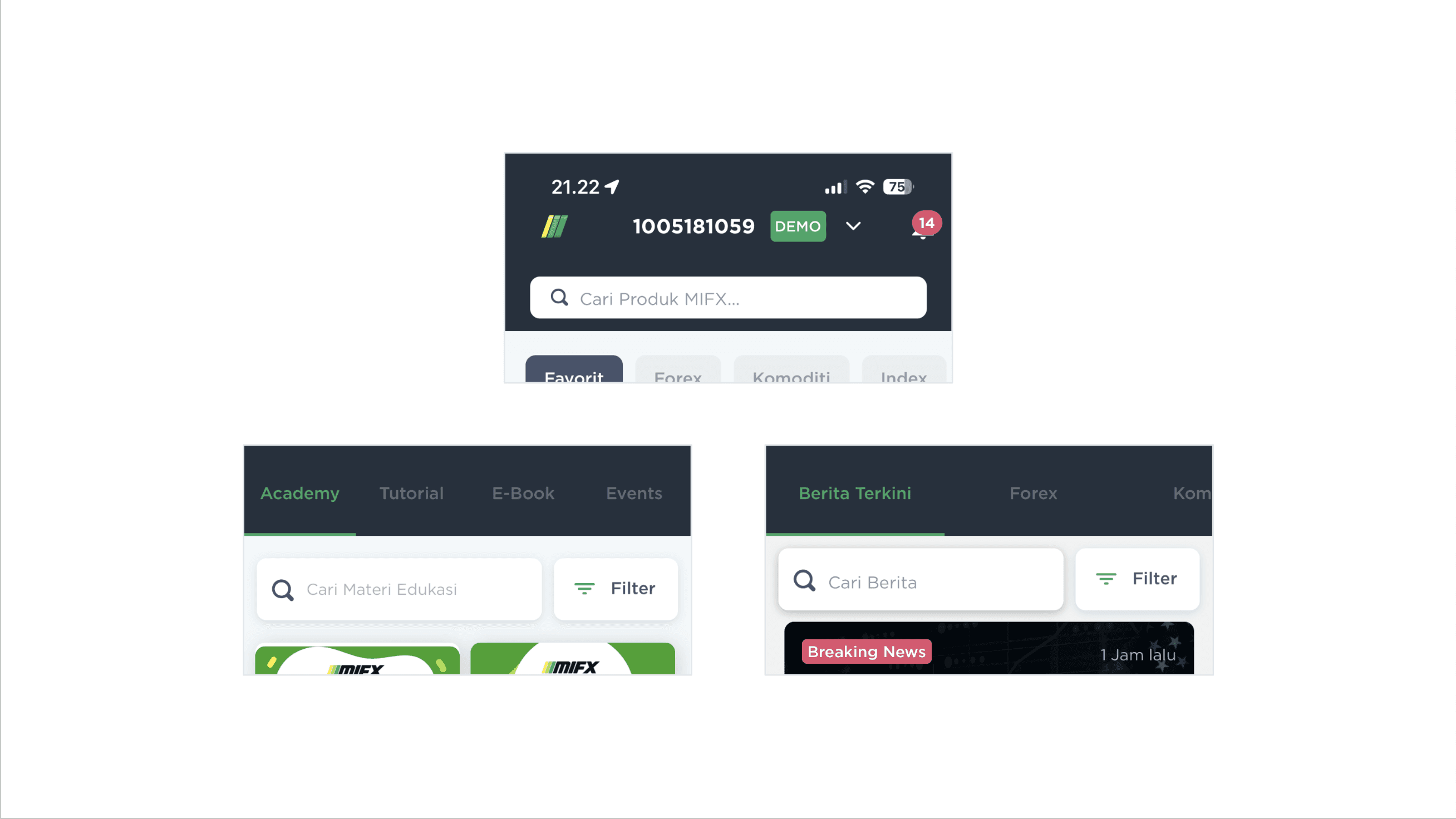
We had three different looks for the same search bar component.
When I say "the design system wasn't working," I mean it was broken at every layer, and a lot of the breakage was easy to find once we started looking.
The same component, multiple times over. A search bar is one of the most basic components in any product. Ours existed in three different visual treatments across the app: one on the product search, one on the education page, one on the news page. Same job, three different looks. Three different implementations to maintain. Three different first impressions for users.
Different looks on various components, forcing users to relearn the pattern on different pages.
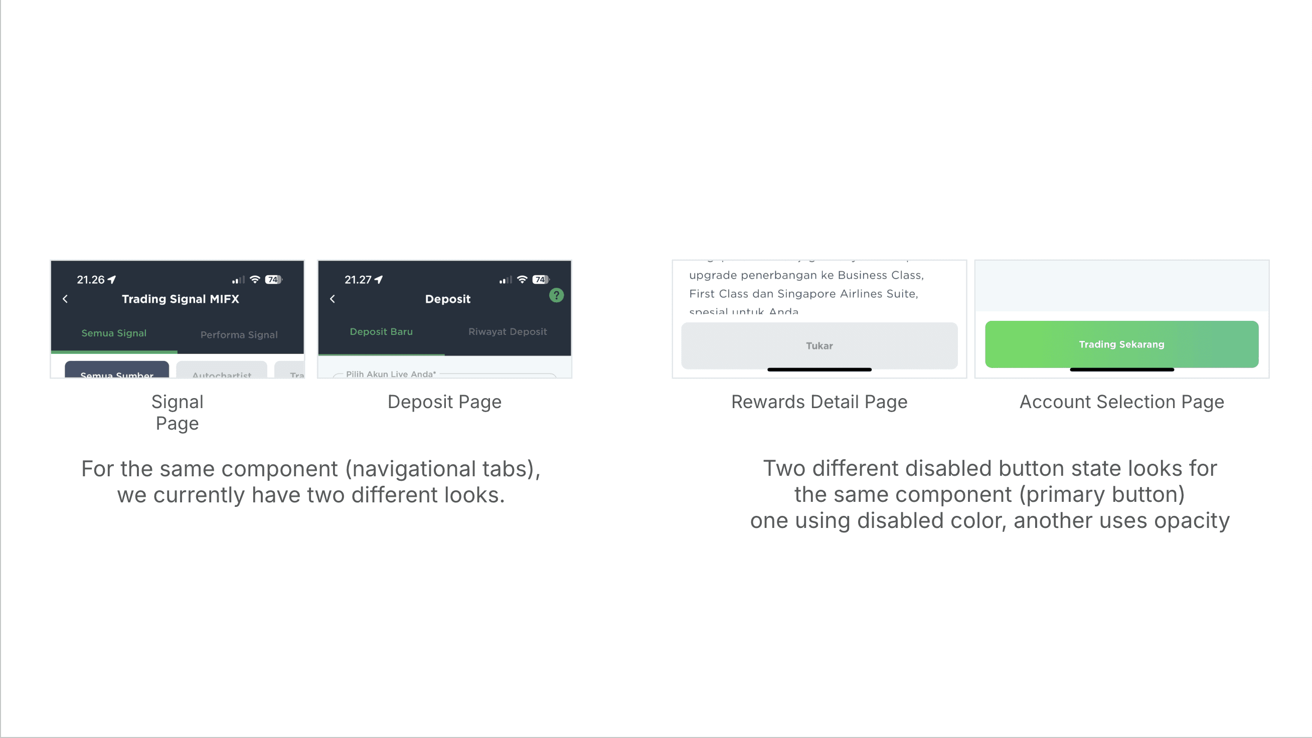
The pattern repeated across other primitives. The navigational tabs in the Signal page and the Deposit page rendered differently. The disabled state on a primary button looked one way on the Rewards Detail page and a different way on the Account Selection page, so a user who learned "gray means disabled" on one screen had to relearn the convention on another.
Bottom sheets, which appear constantly in mobile flows to present information and require acknowledgment, existed in at least four distinct stylings depending on where they showed up.

We had four different looks for the same bottom sheet component.
The inconsistencies weren't just aesthetic. They were producing real usability problems. Across multiple screens, UI elements sat inside the iPhone's safe area zone, the reserved region at the top and bottom of the device where the OS expects to render its own controls (the home indicator, the camera notch, system status). Tappable elements like "Lupa Pin?" links, primary CTAs, and chart controls were overlapping with the home indicator, making them harder to reach and visually competing with the OS elements (which always gets the priority visually). Apple's Human Interface Guidelines document exactly which areas a third-party app should leave untouched, and several of our screens were ignoring them.
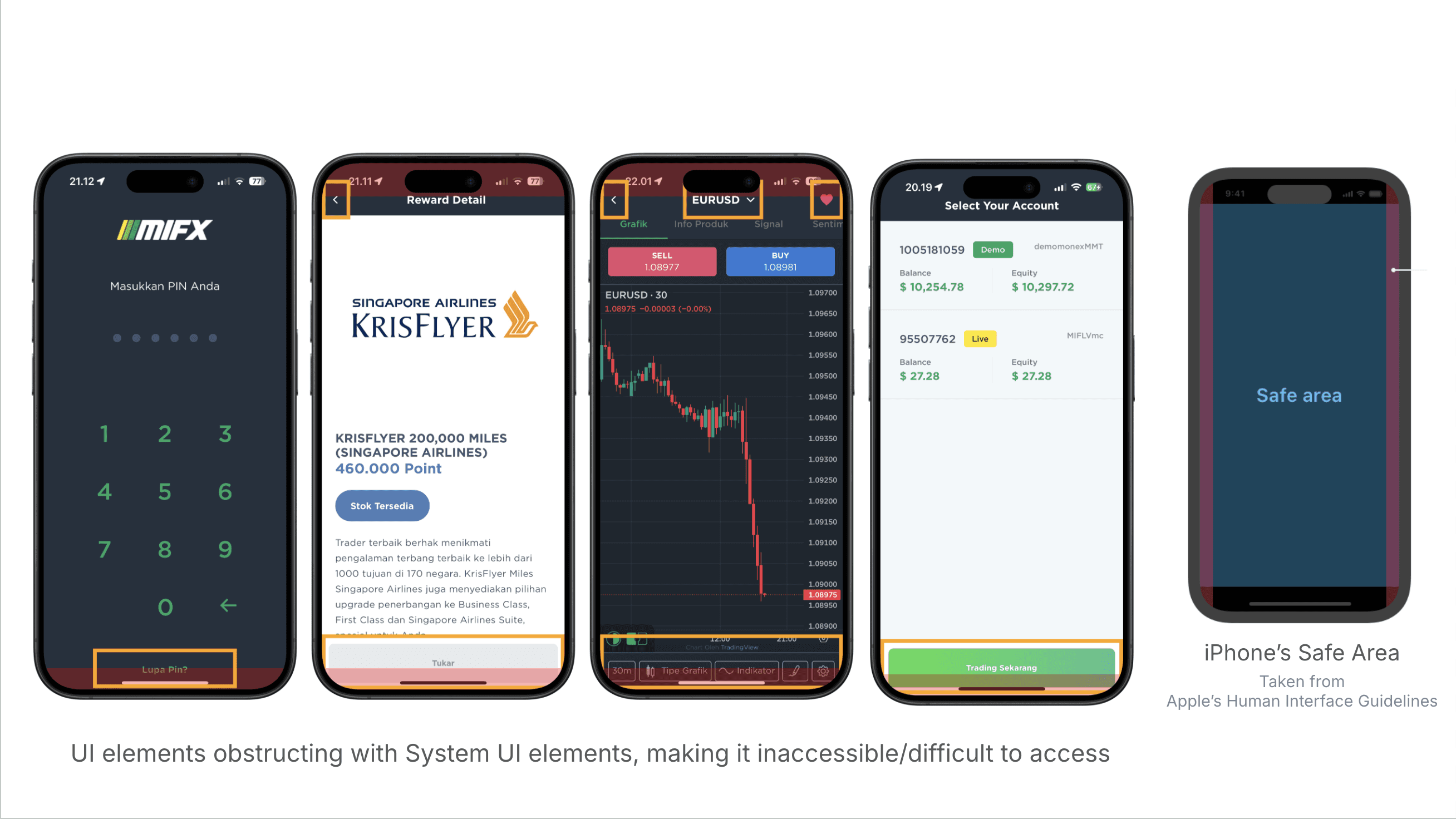
Critical touch areas were placed on inaccessible places in the screen, obstructing system elements.
The surface symptoms above came from the same underlying cause: the foundations weren't really foundations. There was no agreed-upon color logic, no shared type scale, and no spacing system that the team actually used. On spacing specifically: some designers used a 5px base, some didn't think about base units at all, and one file I opened had a padding value of 17.12px. I personally worked on a 4px base with a few documented exceptions, but that was a private practice, not a team practice.
So this wasn't a polish job. The whole foundation needed to come back up.
The window
Someday became now in Q1 2024, when the CTO announced a full codebase rewrite. The discussion started early in the quarter, and the real work followed in late Q1.
That changed everything. If engineering was rebuilding from scratch, design had a window we'd never get again. We could either retrofit a new system onto a freshly-written codebase later (painful, slow, doomed), or ship a new system alongside the rewrite so the new code was born already speaking the right language.
Pushbacks
Not everyone was sold on the rebuild from the start. There was real pushback, and across several axes at once: whether the rebuild was the right thing to do at all versus polishing what we had, whether the scope had to be everything or could be narrower, whether six months of design work before any screens got touched was tolerable, whether design system effort was the right priority against feature work that drove business outcomes. Some of these concerns were legitimate and improved the plan. Some were more political, and I worked around them rather than through them.
Each axis needed a different answer.
For whether to do it at all and the scope question
The cleanest argument turned out to be an engineering one. The codebase rewrite was happening regardless. The question wasn't whether the design system was worth investing in by itself, it was: do you want to rewrite the frontend once or twice? Once meant the backend rewrite landed alongside a new frontend built on a new design system, all in one sustained effort. Twice meant rewriting the frontend now to fit the new backend with the old design baked in, and then rewriting it again later when the inevitable design refresh happened. The math of "once vs twice" doesn't need a design argument. It speaks directly to engineering's interests. The design rebuild stopped being a tax on the codebase rewrite and started being the cheaper path through it.
For the timeline pushback
The answer wasn't an argument. It was a demo. I stopped trying to defend the timeline abstractly and started showing early visual progress to stakeholders, mockups of what the new MIFX would look like once foundations landed. The vision became visible. The pushback dissolved. Stakeholder doubt about a six-month plan isn't really about timeline math, it's about trust. They want to know they can picture the payoff. Once they could see it, six months stopped feeling like a void and started feeling like a runway.
For the priority pushback (design system versus feature work that drives revenue)
I proposed something different from a verbal argument: a measurement framework. Three categories of metrics, Productivity (new components, enhancements, releases, doc sites), Coverage (products using the system, components in use, percentage of pages applying it, number of detachments), and Efficiency (task completion time, time from idea to market, number of one-off "snowflake" components).
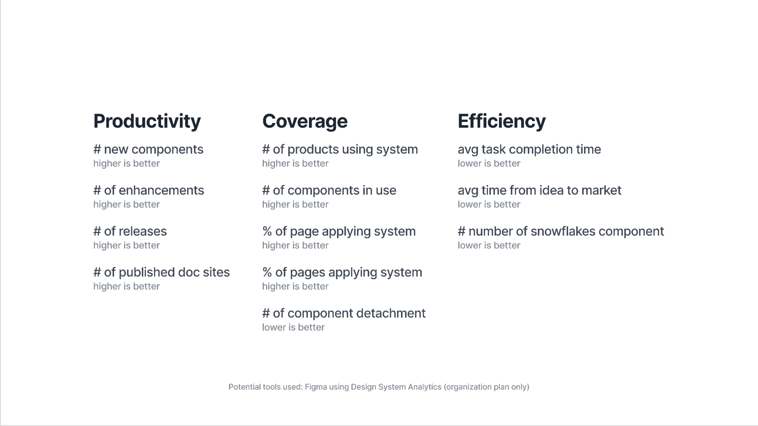
Design System Metrics to be tracked
Not only covering the design system usage across teams, we also plan to track workflow improvements across design and engineering from development days to code linter warnings.

Design & Engineering Workflow metrics to be tracked
The framework required upgrading our Figma plan from Pro to Organization, since Design System Analytics is only available on the Organization tier. Rather than ask for the upgrade narrowly, I built a fuller business case with five use cases the upgrade would unlock.
Design System Analytics for the metrics.
File Branching so multiple designers could work on parallel features without polluting the main file and in return also improving our messy file management.
Code Connect for surfacing real production code snippets in Figma instead of autogenerated examples for the engineering teams.
Unlimited Teams within Organization to let me organize files by product surface instead of cramming everything into one shared workspace. And
Organization-tier security (activity logs, SSO, domain-restricted access), which a regulated financial product needed regardless of the design system.
The proposal came with a defensible cost breakdown: 15 design seats, 12 developer seats, 5 collab seats, $1,150/month annual pricing. Stakeholders approved the upgrade. The metrics ran during rollout, and they ended up informing real system decisions, including which components to prune when usage data showed they weren't earning their place.
The skill that ended up mattering most across the whole project wasn't the design work itself. It was telling legitimate concerns from political ones, and responding to each with the appropriate kind of answer: an engineering argument, a demo, a measurement framework, or sometimes just patience.
The approach
Two parallel decisions.
I started with foundations first, then built upward. Color, type, spacing, radius, borders, iconography, then components, then patterns. Standard dependency order, but worth saying out loud because it's easy to get pulled into "let's redesign the dashboard" and never actually fix the things underneath.
I also used Untitled UI by Jordan Hughes as the structural reference. Not for the visual identity, but for the architecture. Token naming, documentation structure, file organization, the boring scaffolding that every system needs and that I had no interest in reinventing.
What Leverage is
In the FX trading world, leverage is the mechanism that amplifies the effect of a trader's capital. A small position can move a much larger one. This design system was meant to do the same thing for the team: a small piece of well-built infrastructure should amplify what every designer and developer produces from it. The metaphor isn't subtle, but it lands cleanly in a trading product, and naming things well is part of getting them adopted.
Leverage initially covers four surfaces:
App (the mobile trading product),
Client Area (the web-based account management interface),
Website (the marketing surface), and
IB Dashboard (the partner-facing tool for introducing brokers).
It was designed alongside the engineering rewrite so the new code shipped with the new system from day one. It was also designed to map directly to MIFX's core company values, Safety, Seamless, and Speed, which meant the foundation decisions weren't just technical, they were tied to the company's stated commitments to users.
This case study is split into three parts, one for each layer of the system. Each part goes deep into the decisions behind the work: not just what got built, but why it was built that way, what was discarded along the way, and what the real constraints turned out to be. Here's what each part covers.
Foundations
At the foundation layer, Leverage is built on a 4px scale expressed in rem, with mobile and desktop dual-tracked where it matters. Color lives in a three-layer architecture (primitives → functional roles → surface and theme), with brand colors that satisfy both light and dark modes from a single ramp. Typography is Inter with a product-vs-marketing dual scale and tabular figures globally for trading data. Radius, borders, and iconography fill in the rest. Each foundation has a story behind it, and the Foundations document is where those stories will be delve deeper.

Components
At the component layer, Leverage uses property-based Figma components organized around nested components models rather than variant matrices. Decisions are curated rather than combinatorially complete: the library ships what designers actually reach for, not every possibility the architecture would allow.
Two architectural patterns showed up repeatedly during the work: build, instrument, prune (ship the reasonable version, measure what gets used, remove what isn't earning its place) and build, observe, extract (when extending a component starts producing mutually exclusive props, break a new component out).
Underneath all of it, Leverage was meant to function as a single source of truth for designers and developers, the shared vocabulary that lets a Figma file and a production codebase describe the same thing in the same words. Most of what follows in the three deeper documents is the story of how that vocabulary got built, decision by decision, and how it held up under real product pressure.
UP NEXT IN THIS SERIES